

Phase 1: Brand Guide Development
Colors: Katie Guerra (Blossom & Bloom Owner) knew she wanted a French countryside-inspired look to her brand. After reviewing the color palette options she was drawn to, KMC created this palette.

Fonts: Knowing Katie was going with this French-countryside, floral feel, KMC provided several options for Katie to choose from. After picking the fun, nature-inspired script font that ultimately made up the Blossom & Bloom logo, a complimentary serif font was chosen as the primary brand font.

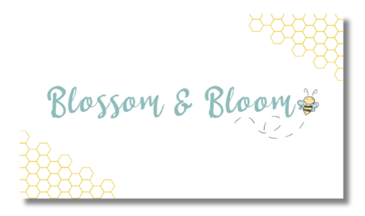
Logo Design: Armed with a strong color palette and font array, KMC began logo design. Katie specifically requested a bee make an appearance in the logo. One the horizontal logo was created, a hexagon logo was made to accompany it as a stacked option. KMC finds that brands like to have a few variations of their logo for different purposes and is happy to provide them! This also includes an inverse logo so that it may be used on your brand colors! After these two initial logos were designed, KMC created alternatives for Blossom & Bloom to use on their social channels!


Official Brand Guide: Once the colors, fonts, and logos are complete, it’s time to package them together into the brand’s official Brand Guide.

Phase 2: Website Development
KMC helped launch Blossom & Bloom’s Squarespace website, including building out page layouts, creating custom headers, starting the blog, setting up a subscription service (Bloom Box), and calendar of events.
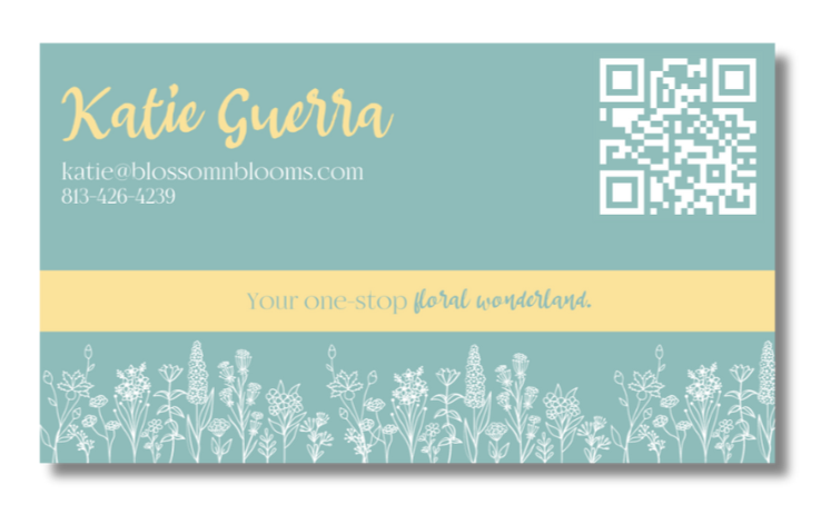
Blossom & Blooms initial requests for tangible marketing assets included business cards and a sign for their booth at local markets. KMC worked with Katie to create the perfect options!
Phase 3: Marketing Materials

Phase 4: Brand Photography


KMC remains at Blossom & Bloom’s fingertips, ready for the next branding or marketing request. Once we have a relationship, my door is always open!