SAMSKARA YOGA
BRAND IDENTITY DESIGN
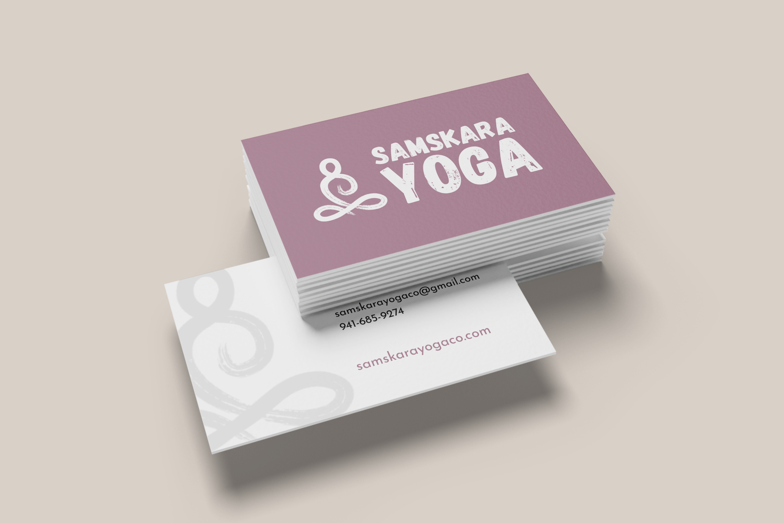
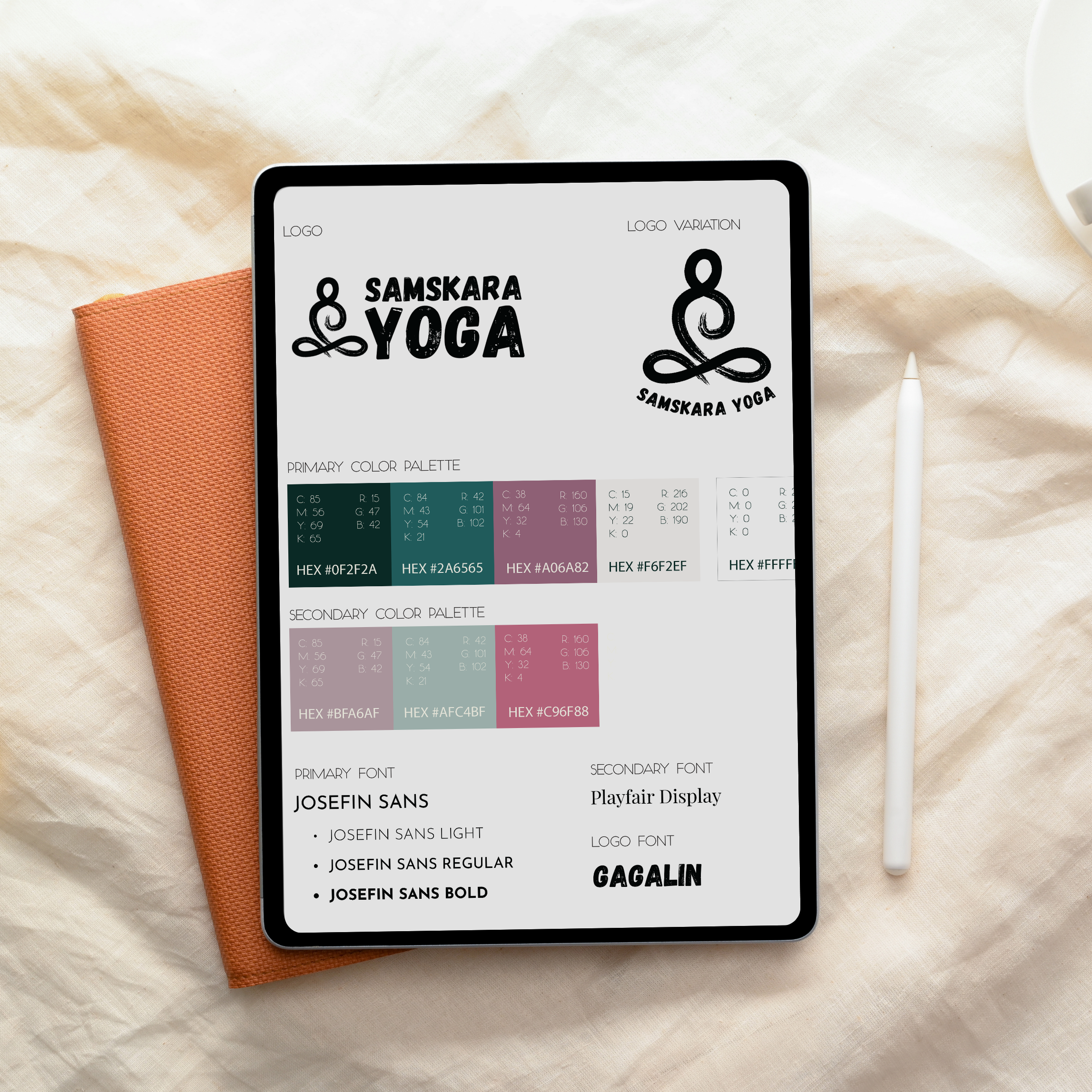
COLOR PALETTE | LOGO | TYPOGRAPHY
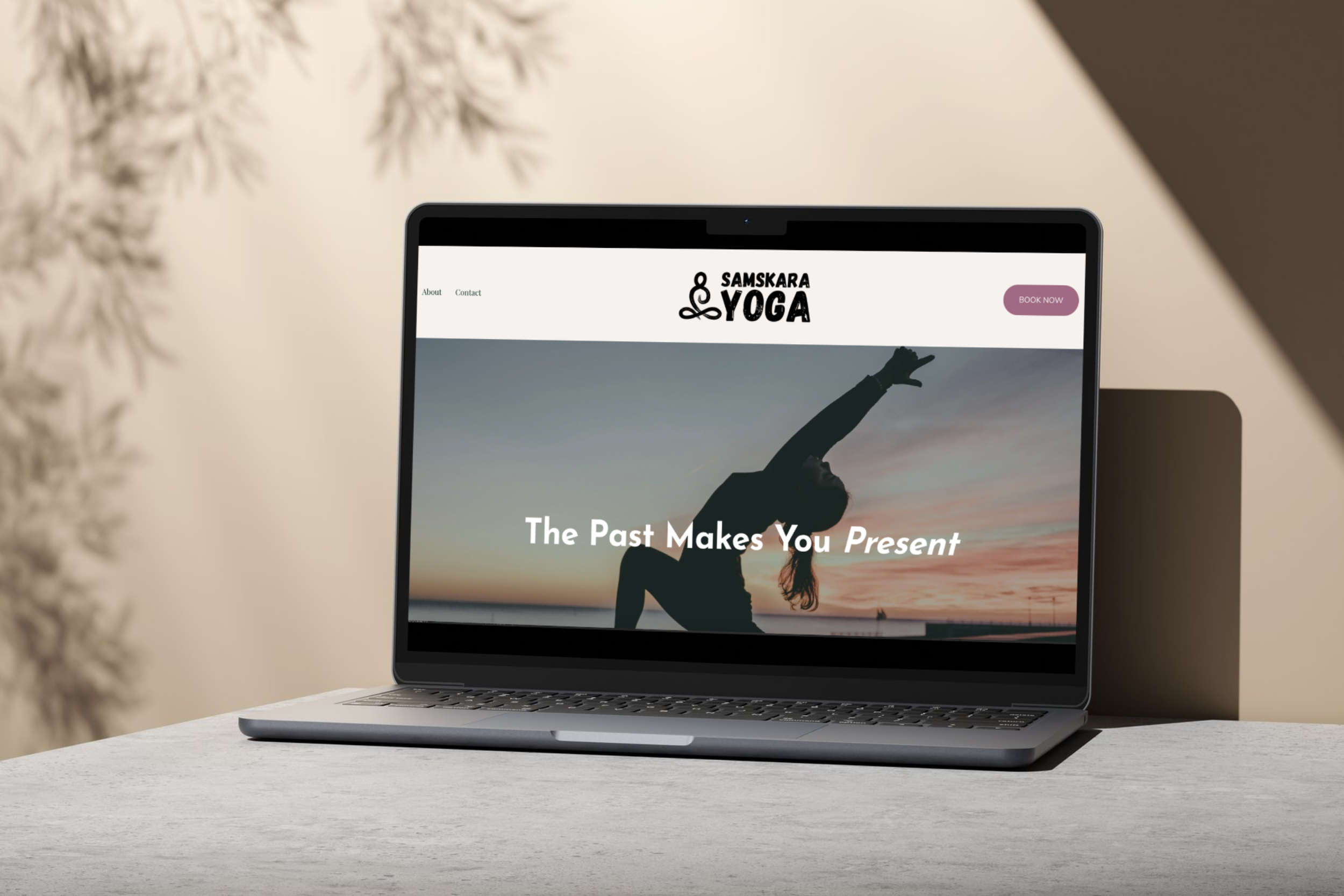
WEB DESIGN
SQUARESPACE
THE CLIENT
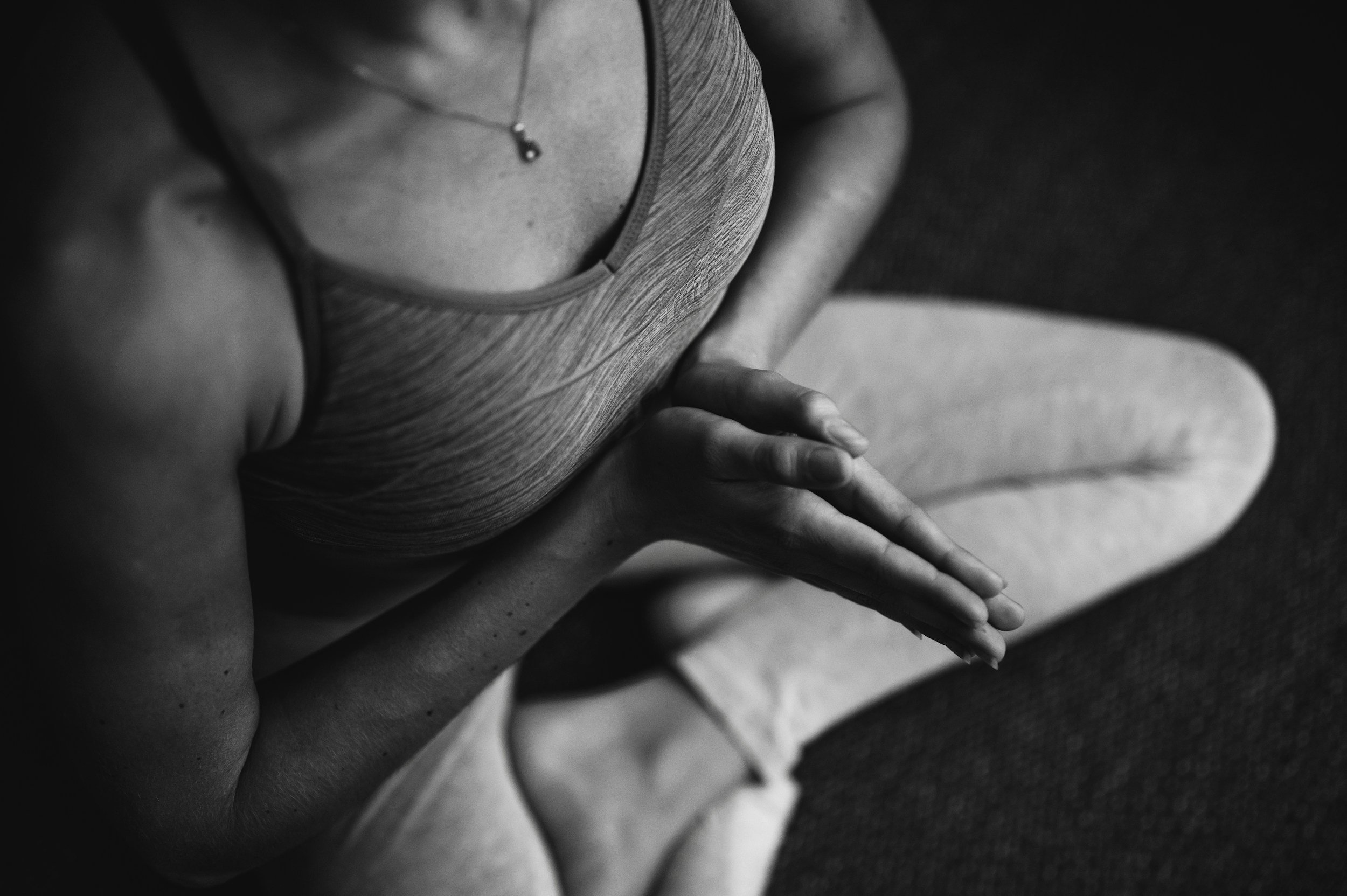
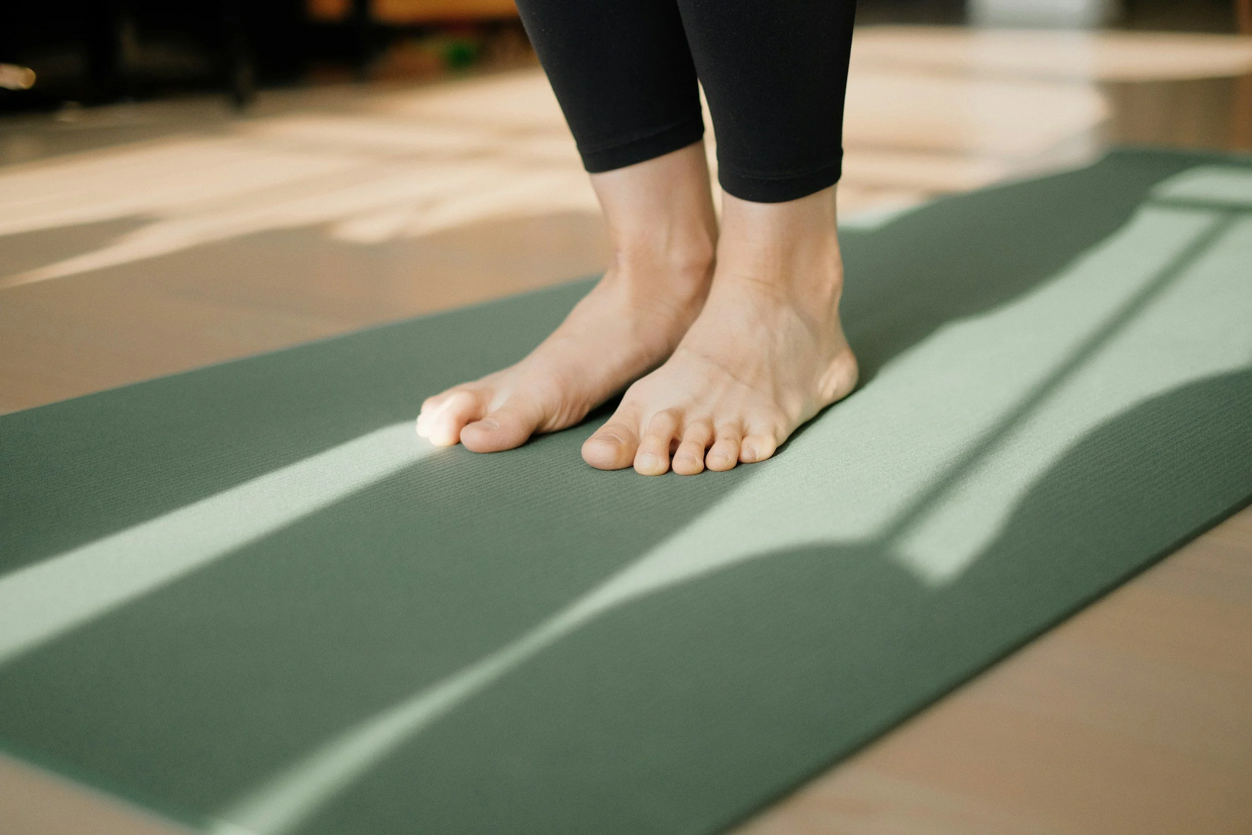
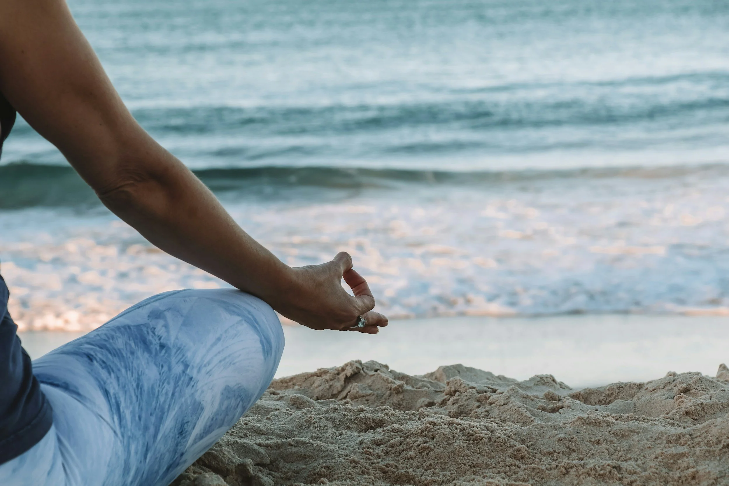
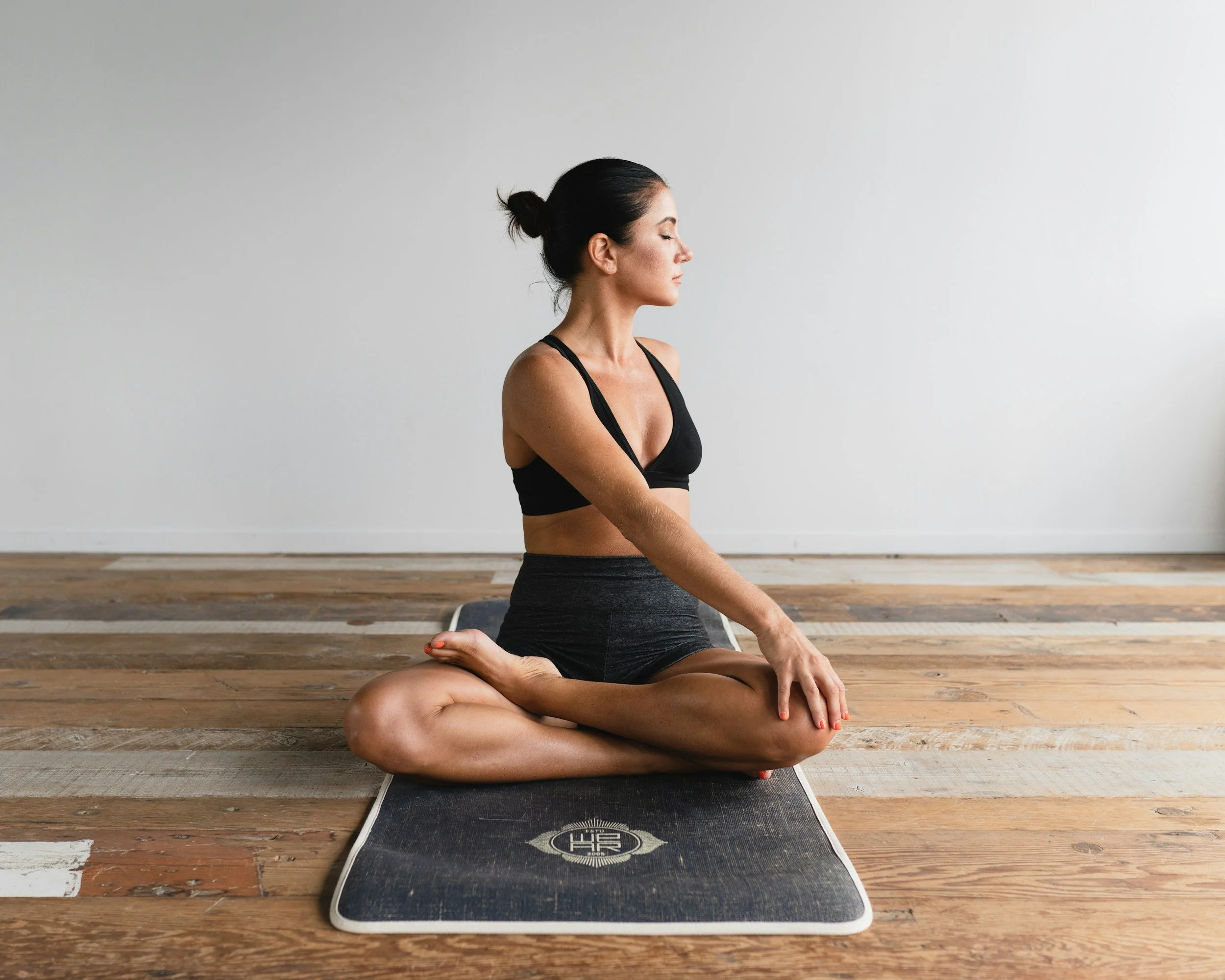
Samskara Yoga is a yoga practice out of Bradenton, FL that offers private, personalized yoga and meditation sessions tailored to any group’s needs and skill level. The neat thing about them is that (much like me) they travel to their clients! They offer sessions at the beach, vacation rentals, local parts, or event spaces. In fact, they even host regular sessions at the new Mote Aquarium site. (Mote SEA). Kasey is the owner of Samskara Yoga and a longtime friend. When she asked about having me do her branding and website for Samskara I jumped on the opportunity. Kasey had an idea of what she wanted but was having a hard time nailing it down. Enter Katie Murray Creative.
THE OBJECTIVE
Kasey needed a complete brand identity suite for this brand-new venture, including logo design, color palette development, typography, and a visual direction that could eventually extend seamlessly into web design and marketing materials.
There were a few important pieces she already knew she wanted to incorporate. The lotus-position icon used in the logo was one of them, along with an initial color palette she had started exploring on her own. Beyond that, the bigger challenge was defining the emotional direction of the brand.
The goal was to create a visual identity that felt:
Grounded and calming
Feminine without being overly delicate
Elevated, but still approachable
Nature-inspired without leaning cliché or overly “boho”
Modern, warm, and restorative
Most importantly, the brand needed to reflect the actual experience Samskara creates for clients: intentional, welcoming, personalized, and deeply connected to mindfulness and movement.
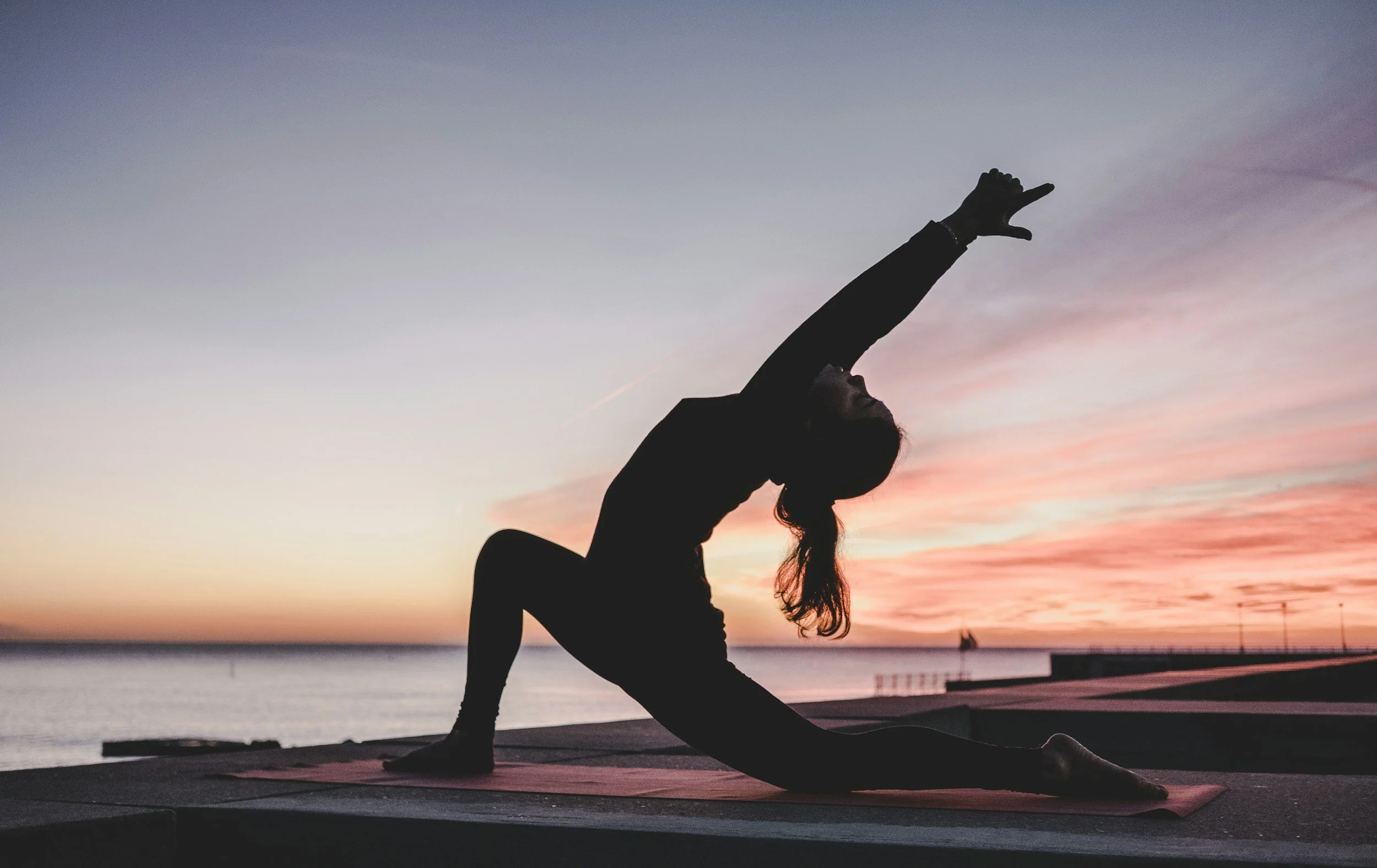
THE SOLUTION
I started by refining the color palette, taking the initial ideas Kasey provided and developing them into a more mature, grounded system that aligned with the atmosphere she wanted Samskara Yoga to create.
The final palette combined deep green-teals, muted mauves, soft neutrals, and warm rose tones to create a balance between earthiness and refinement. Throughout the process, I intentionally adjusted the palette to feel warmer and more inviting, avoiding anything too cold, corporate, or trendy.
From there, I built out the typography system and broader visual identity. I chose fonts that felt breathable, modern, and human — balancing softness with enough structure to still feel polished and professional. Every element was selected to support a calm, elevated user experience without feeling intimidating or overly stylized.
As the project evolved, the brand positioning became clearer too. Samskara Yoga wasn’t trying to be a loud fitness brand or lean into a hyper-spiritual aesthetic. Instead, the identity centered around connection, mindfulness, movement, and creating a restorative experience that feels approachable from the very first interaction.
The end result was a cohesive visual identity system that feels calm, intentional, and quietly luxurious — giving Samskara Yoga a strong foundation to grow into both digitally and in person.
“I'm obsessed with what you have done—it's exactly what I envisioned and what I didn't know I wanted!”
— Kasey, Owner of Samskara Yoga